In recent years, data has become one of the most valuable assets for individuals and organizations alike. From business decision-making to academic research, the ability to analyze and interpret data effectively plays a crucial role in achieving meaningful outcomes. However, while data itself is abundant, extracting insights from it is not always straightforward. This is where data visualization comes into play.
Visualization transforms raw numbers into visual formats that are easier to understand and interpret. Among the various types of visualizations available, scatter plots are particularly useful for exploring relationships between two variables. They allow users to quickly identify trends, patterns, and anomalies that might otherwise remain hidden in spreadsheets or raw datasets. Despite their usefulness, creating scatter plots has not always been a simple task.
Traditionally, users relied on software like Excel, statistical tools, or programming environments such as Python and R to generate scatter plots. While these tools are powerful, they often require a certain level of technical knowledge. Even basic tasks—such as formatting axes, adjusting labels, or refining the appearance of data points—can become time-consuming. For many users, especially those without a technical background, this creates a barrier to effective data analysis.
The emergence of web-based tools has significantly changed this landscape. A modern scatter plot graph generator allows users to create visualizations quickly and with minimal effort. Instead of navigating complex software interfaces, users can simply input their data—either by uploading a file or pasting values—and instantly generate a scatter plot. This streamlined approach reduces friction and makes data visualization accessible to a much wider audience.
One of the most important advantages of these online tools is their ease of use. Most platforms are designed with intuitive interfaces that guide users through the process step by step. This simplicity is particularly valuable for beginners, students, and professionals who need quick insights without investing time in learning complex tools. By lowering the barrier to entry, these platforms enable more people to engage with data directly.
Another key benefit is real-time interactivity. Unlike traditional tools that require multiple steps to update a chart, many online generators allow users to see changes instantly. As data is modified, the visualization updates in real time. This makes it easier to experiment with different scenarios, test assumptions, and refine analyses without starting from scratch. The ability to interact dynamically with data leads to deeper insights and more efficient workflows.
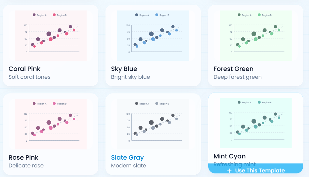
Customization is also an essential feature. A good scatter plot graph generator provides options to adjust axis labels, colors, point sizes, and even add trend lines or regression curves. These features help users tailor their visualizations to specific needs, whether for internal analysis or external presentation. Clear and visually appealing charts can significantly improve how insights are communicated and understood.
Accessibility is another major factor driving the adoption of online tools. Because they are web-based, users can access them from any device with an internet connection. This flexibility is especially important for remote teams, freelancers, and organizations that rely on distributed workflows. There is no need for installation or system compatibility checks, which simplifies the overall experience.
Collaboration is also enhanced through these platforms. Many tools allow users to share visualizations via links or export them as images and files. This makes it easier to present findings to colleagues, clients, or stakeholders. In collaborative environments, the ability to quickly generate and share insights can significantly improve decision-making and productivity.
From a business perspective, the benefits are substantial. Teams can analyze data faster, identify trends more quickly, and respond to changes with greater agility. Marketing teams, for example, can visualize campaign performance across channels, while sales teams can explore relationships between pricing and conversion rates. Product teams can analyze user behavior to inform feature development. All of this can be done without relying heavily on specialized data analysts.
In education, these tools also play a valuable role. Students can interact with data in a hands-on way, making abstract concepts such as correlation, variance, and distribution more tangible. This interactive approach enhances learning and helps build a deeper understanding of statistical principles.
Scalability is another important advantage. Modern tools are designed to handle both small and large datasets efficiently. As data volumes grow, users can continue to rely on these platforms without experiencing significant performance issues. This makes them suitable for a wide range of applications, from simple classroom exercises to complex business analyses.
Ultimately, the goal of any data visualization tool is to make information easier to understand and act upon. By removing unnecessary complexity and focusing on usability, a well-designed scatter plot graph generator enables users to focus on what truly matters—extracting insights and making informed decisions.
In conclusion, online graph tools have transformed the way we approach data analysis. By combining simplicity, flexibility, and accessibility, they empower users at all levels to create meaningful visualizations quickly and efficiently. As data continues to play a central role in modern decision-making, these tools will become increasingly essential in helping individuals and organizations turn raw data into actionable knowledge.